Breaking Out of Margins: The Full-width Background Image CSS Trick

I hope you enjoy reading this post. If you'd like to work together Contact Me
Author: Joe Czubiak | Creator of Barnacles | Serial Indie Maker
As web developers, we often set default page margins that apply to the whole website in order to make the site look nice and be user-friendly. This creates a bit of a headache when we want to add design elements like hero images that need to span the full width of the viewport ignoring those margins.
The naive approach might be to restructure your HTML, moving the full-width section outside of your constrained container. That's not a good idea. You shouldn't need to restructure you whole website just to add a design element to a single page.
All you need is a little bit of clever CSS magic.
The Magic 🪄
Here's the CSS trick that saves the day:
<section
class="relative overflow-hidden w-screen -mx-[calc(50vw-50%)]"
>
<div
class="absolute inset-0 bg-cover bg-center bg-no-repeat"
style="background-image: url('/image.jpg')"
>
<!-- Some sample content -->
<div
class="absolute inset-0 flex flex-col items-center justify-center bg-gradient-to-l from-cyan-900/85 via-cyan-800/70 to-cyan-900/85 text-white"
>
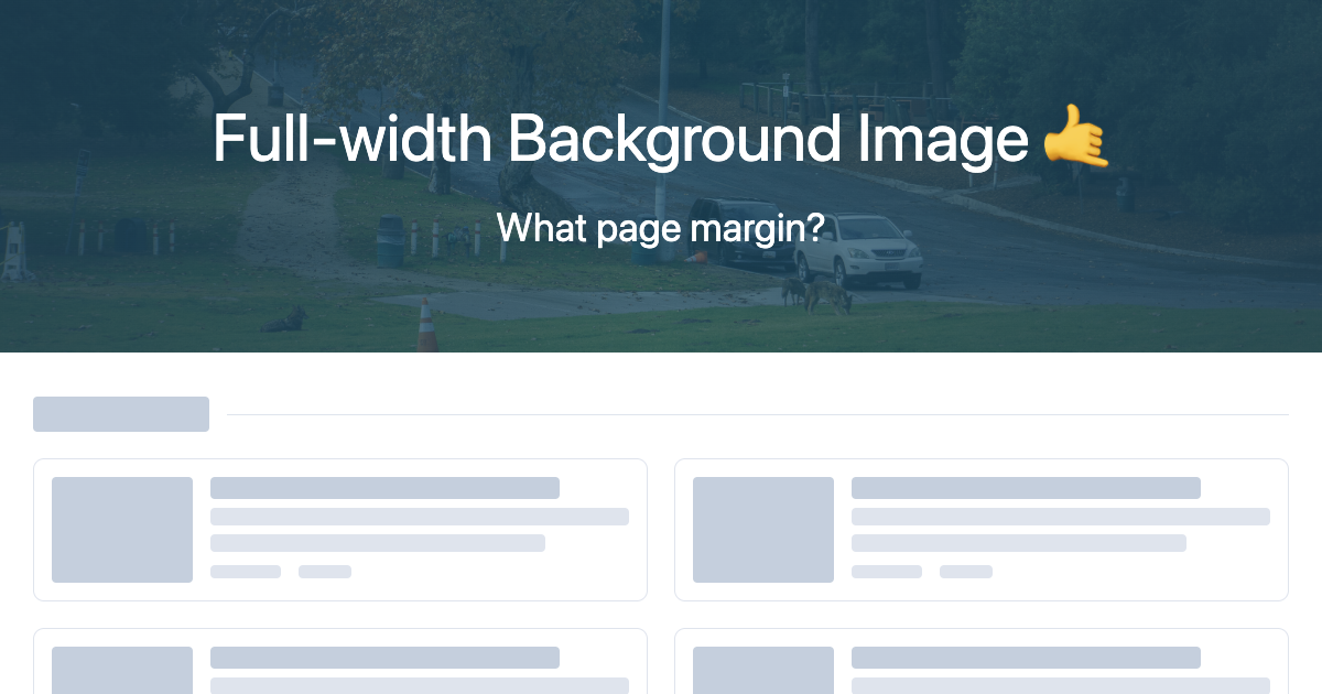
<p class="text-6xl">Full-width Background Image 🤙</p>
<p class="mt-8 text-4xl">What page margin?</p>
</div>
</div>
</section>
I'm using Tailwind CSS here but you could also use regular CSS. The main trick being
width: 100vw;
margin-left: calc(-50vw + 50%);
margin-right: calc(-50vw + 50%);
Breaking it down 🐇
Let's dissect what's happening here:
w-screen or width: 100vw - This sets the width to 100% of the viewport width, but this won't break through the page margins on its own.
-mx-[calc(50vw-50%)] or margin-left: calc(-50vw + 50%) margin-right: calc(-50vw + 50%) - This is where the magic happens. We're pulling the left edge of our element to the left edge of the viewport. Here's the math:
50vwrepresents half the viewport width50%represents half of our element's width (which is 100vw, so this is also 50vw)- The negative margin pulls our element left by exactly the amount needed to align its left edge with the viewport's left edge
overflow-hidden- Prevents any content from spilling outside our carefully calculated boundaries.
The background image setup uses absolute positioning to fill the entire section, with an optional gradient overlay for better text contrast.
Why This Works
The beauty of this technique lies in the mathematical relationship between viewport units and percentages. No matter where your element sits within a constrained parent container, these calculations will always position it to span the full viewport width.
The element essentially "breaks out" of its parent's boundaries while remaining in the natural document flow.
When to Use This Trick
This technique shines in scenarios like:
- Hero sections on blog posts or landing pages
- Full-width testimonial or quote sections
- Background image breaks in long-form content
- Banner advertisements or call-to-action sections
- Image galleries that need to span the full viewport
Browser Support
This technique has excellent browser support since it relies on:
- CSS calc() function (supported in all modern browsers)
- Viewport units (vw, vh) (widely supported)
- Standard margin properties
Your turn 🧞
Now that you're a magician yourself, next time you need to break out of content margins for a full-width background, try this handy CSS trick.
Have you used this technique in your projects? I'd love to hear about other creative ways you've solved similar layout challenges.