Box-Shadows

I hope you enjoy reading this post. If you'd like to work together Contact Me
Author: Joe Czubiak | Creator of Barnacles | Serial Indie Maker
I've become mildly obsessed with box-shadows. When they are done well, they're magic. They provide depth, contrast, and clarity to the page. When done poorly, they're distracting. It's apparent to me that most shadows fall short of the magic. It's especially true when I try to apply my own handwritten CSS box-shadow to an element.
What's behind a good box-shadow?
I keep finding myself reaching for the shadows defined in Material Design. They are some of the only ones that I think really get it right. Most design frameworks provide their own version of a decent shadow but I find the concept and execution of elevations in Material Design resonates with me. They also have extensive design guidelines that are worth reading.
I never understood why Material Design shadows are so good and when I make a shadow, it really doesn't look great. They come out too harsh or undefined and unprofessional.
What's the math behind box-shadows?
I see a lot of visual editors like WebFlow or box-shadow generators that give you controls for angle and distance, but angle and distance aren't CSS properties for box-shadow. So then, how do you get the x and y values from angle and distance? Hint: trigonometry is involved.
Why don't CSS generators produce good-looking shadows?
The quick answer is that most of them don't support layers and as you're about to learn, having multiple shadow layers is important.
I had these questions and one night my curiosity got the better of me. At least, I had hoped it would only be one night. It led me back to high school trigonometry and carried me through a weeks long journey into box-shadows. This journey involved building a CSS Box-Shadow generator myself and writing this article that keeps growing in scope.
Alas, here we are, let's get into it.
CSS Box-Shadow
Let's take a look at what the box-shadow CSS property is and the values it allows.
Syntax: box-shadow: x-offset y-offset blur-radius spread color outset/inset
Example: box-shadow: 0px 3px 2px 4px #000;
Box-Shadow Values Explained
x-offset — This is the horizontal offset of the shadow. Higher values will move the shadow to the right like it is traversing the x-axis of a graph. Negative values will move the shadow to the left.
y-offset — This is the vertical offset of the shadow. Higher values will move the shadow further below your object or down the page. Negative values will move the shadow higher vertically up the page. This is the opposite direction you might think of when looking at a graph with the y-axis.
blur-radius — Higher values will increase the blurriness and also increase the size of the shadow leading the shadow to become lighter in color. This number can't be less than 0.
spread — Higher values will increase the size of the shadow without causing any loss of sharpness.
color — Specifies the color of the shadow.
* outset / inset — You can specify the box-shadow to be inset instead of the default outset. This will make the shadow appear inside of the object instead of outside of it. This article is about outset shadows and won't touch on inset shadows.
There's a little bit more to the box-shadow that I did not cover here and I encourage you to look it up elsewhere if you need to know more. This is a good basic understanding for us to use.
The thing that isn't obvious while working with box-shadows is that you can specify multiple shadows on the same element. Simply, use commas to separate multiple values.
Angle and Distance
It's very common to see the inputs angle and distance in visual editors such as WebFlow and they forgo the x and y offsets. You'll notice though that neither angle nor distance is one of the attributes defined above.
How do angle and distance translate to x-offset and y-offset?
To answer this, we need to dive into some trigonometry.
The x offset and y offset can be thought of as the x and y coordinates on a graph. Because of this, we can draw a right triangle on the graph from the center point. If you can remember back to your trigonometry days, right triangles are the very basis of the 6 fundamental trig functions.
I'm going to show you how to calculate the values forwards and reverse. From angle and distance to x and y and then from x and y to angle and distance.
Math
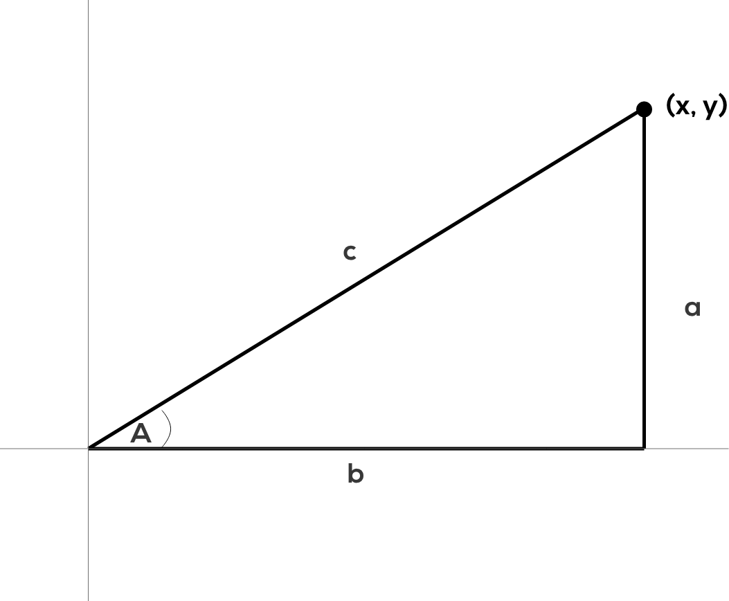
Take a look at this graph. We're going to use it as the basis for our calculations.

The x and y coordinates are the x-offset and y-offset of the box-shadow properties. When you plot it onto a graph, like the graph shows, it creates a right triangle and the perfect setup for doing a little trigonometry.
If you understand trig or stare at this graph long enough you'll see how all the pieces fit together. When given the options of angle and distance instead of the x and y, we can see that the angle is angle A in the graph and distance is c or the hypotenuse of the triangle formed.
These are the two basic functions of trig and the two that we need for our calculations.
sin(x) = opposite/hypotenuse = a/c
cos(x) = adjacent/hypotenuse = b/c
Angle and distance to x and y
Angle and distance to x and y is the calculation that visual editors would use. We let the user pick an angle and distance and then we convert that into an x and y coordinate to use as the x-offset and y-offset in CSS.
We can use the functions defined above.
X in our case is the angle, we'll call it angle A as we can see on the graph.
a is our y offset.
b is our x offset.
c is our distance.
In this case, we know the values of angle A and the distance, c. So we need to solve for a and b.
We will need to use both the sin and the cos functions. Sine will give us a, our y, and Cosine will give us b, our x.

If we rearrange the functions they will look like so.
cos(A) * c = b
cos(A) * distance = y
sin(A) * c = b
sin(A) * distance = x
Using real numbers
angle = 70
distance = 9
sin(70) * 9 = x
3.08= round down to 3 = x
cos(70) * 9 = y
8.45= round to 8 = y
(x, y) = (3, 8)
x and y to angle and distance
This is the calculation to take the x-offset and y-offset from our CSS values and convert it to an angle and distance that we could show to a user in a visual editor.
a is our y offset.
b is our x offset.
In this case, we know the a and b values and we need to solve for angle A and distance.
Distance
We know that distance is c and c can be calculated using good old Pathagoreum's theorem. a^2 + b^2 = c^2.
distance = c = sqrt(a^2 + b^2)
Angle
To find the angle, we need to do the inverse of the previous calculations, we need to use inverse sine, arcsin, or inverse cosine, arccos. We can use either arcsin or arccosine because we know the values of each of the sides of the triangle.
We can take the inverse of our function from before and solve for the A in sin(A).
A = arcsin(a/c) or in our terms Angle = arcsin(x/distance).
Using real numbers
We'll use the values we calculated from our angle and distance.
x = 3
y = 8
End result should give use angle = 70 and distance = 9 because those were the values that we used above.
distance = sqrt(8^2 + 3^2) = sqrt(64 + 9) = sqrt(73) = 8.54 = round to 9
angle = arcsin(8/sqrt(73)) = 69.44 = round up to 70
That's it, that's how it's calculated. Not too bad if you think about it for a minute.
These calculations need to be done in radians. If none of the math worked for you, it's likely because your calculator is in degrees mode and you need to flip it to radians.
I built this quick calculator tool that you can use to test your math or inspect to see how it might be done in javascript.
What makes a box-shadow great
Color and opacity, layers, and angle and distance are the three critical parts needed to make a great natural shadow. Get all three right there's no shadow you won't be able to conquer.
Color & Opacity
When creating a shadow by hand, the shadow often appears too dark. A couple of ways that you might be tempted to mitigate this is to change the color to something less black and more gray, off-white, etc. The other attribute you might reach for is the blur. Crank up the blur and it will make the shadow appear less dark and sharp due to the lack of concentration the blur provides.
These strategies might get the job done but it's sloppy and won't give you the best result possible.
A great shadow mimics our perceived physical reality. So then, a contemplative person might ask — what is a shadow? A shadow is caused by an object blocking light and causing a partial absence of light on the surface behind or below the object.
With that as our working definition of a shadow, it changes the way we might think about our options for making a shadow less harsh and more natural.
Let's think through it again.
Black is the absence of light.
A shadow is the partial absence of light.
Therefore, a shadow in our perceived reality is a semi-transparent black.
In CSS, that would mean setting the opacity of our black to less than one. Setting the color to a semi-transparent black now frees us to use the blur value to shape our shadow and not use it to compensate for something else.
Semi-transparent black will also allow your shadow to keep looking good on multiple background colors because the transparency will allow the background color to continue to shine through.
Recommended Opacity Range: 0.04 - 0.25
eg. rgba(0,0,0, 0.2)
Layers
It's not overtly obvious that box-shadows supports multiple shadows on one element but this is the key to a great shadow.
To understand why layering works so well, we need to look at a film technique.
3 Point Lighting
There is a well-established technique in film and photography used to light subjects called 3 point lighting. It solves a simple problem. You need to light a subject, often a person, using artificial light sources but in a way that it looks pleasing. Using a single bright light will cast harsh shadows. Three-point lighting is a technique that solves this problem with a relatively low number of lights, three.
In a traditional setup, you have three types of lights, key light, fill light, and back light. The key light is your brightest source and is often pointed from off-center to the front of your subject. The fill light is a softer light that is often pointed from the other side of the front of your subject to fill in the shadows caused by the key light. The back light is a light that is pointed at your subject from behind and acts to give your subject some definition around the edges.
It's important to realize that a single artificial light source is often too harsh whether you're talking about photography or CSS.
Apply this to CSS
To layer shadows, they must be semi-transparent. If they are not, they cannot compound on each other and will rather block one another making the previous layer mostly useless.
You can think of each layer as being one of the three lights. One of your shadow layers will act as your key light, it will be the heaviest shadow — least transparent. A second layer can be your fill light, a little softer and wider. Lastly, your back light, provides a little extra definition to your edges.
A Material Example
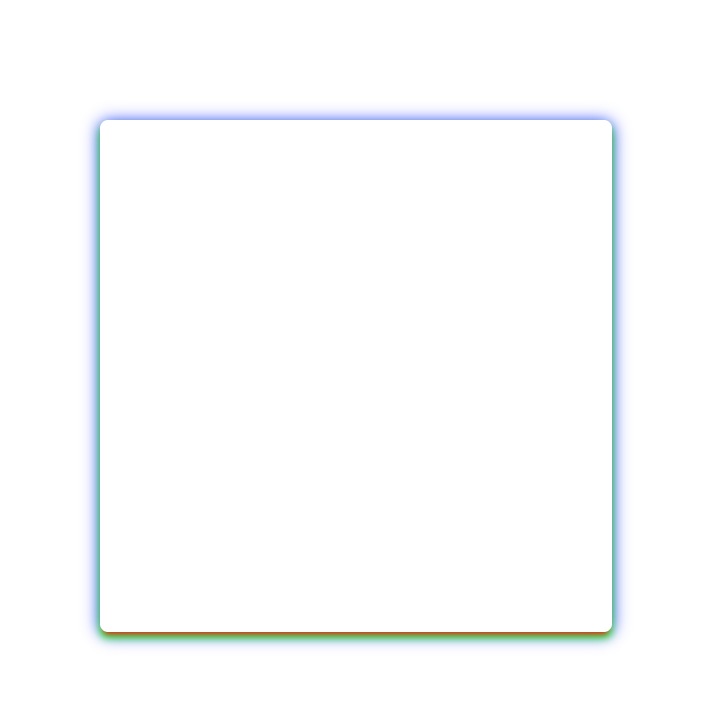
Take a look at how Material Design uses layers to define their shadows.

To see the effect of the layering and what impact each has, I've turned the shadows into red, green, and blue. Opacity 20 layer is red. Opacity 14 layer is green. Opacity 12 layer is blue.
Notice how the colors interact with each other and create colors, like purple, that weren't used. This also highlights the effect that each shadow has on the box.

Elevation
The way a shadow is cast can signify how high above the surface the object is floating. Using different 'elevations' of objects can be an important indicator in your design.
The further an object is from a surface, the larger the shadow it will cast. In CSS this would translate to a larger blur-radius and spread.
The higher an object is, the further down the screen you'll want the shadow to appear.
Using a combo of blur-radius, spread, and y-offset will allow you to portray height.
Into the shadows
With that, my journey comes to an end but hopefully, this is just the beginning of your journey. To experiment with box-shadows, I encourage you to try out the box-shadow generator tool that I built. Good luck. Hope to see you in the shadows.


